Our Southern Transitional kitchen design has been 5 months in the making, and was worth the wait! Today I’m sharing cabinet color, wallpaper detail & more!
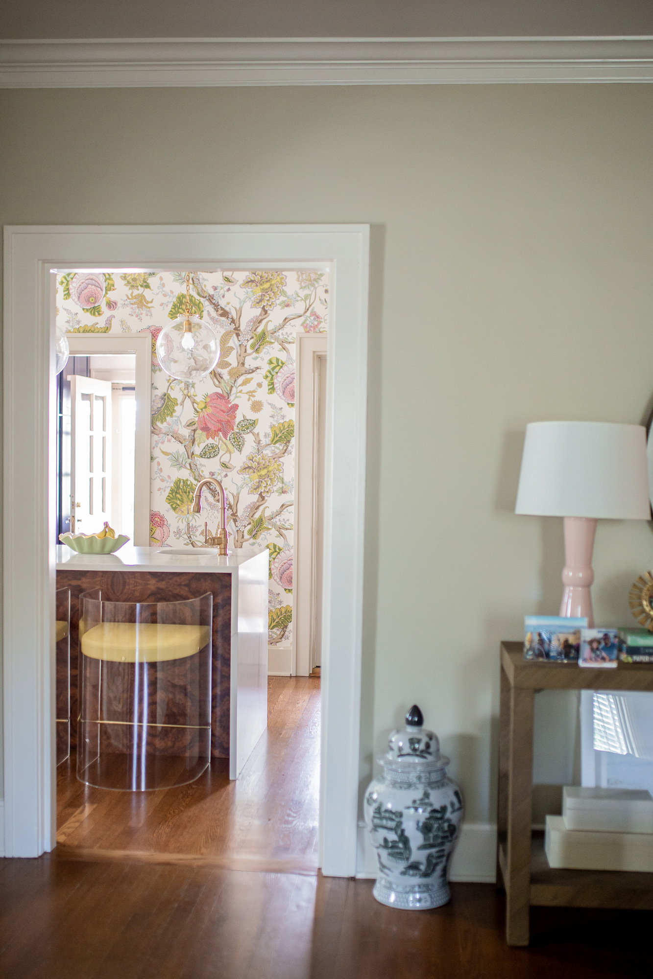
I am giddy over here finally writing this blog post for y’all! If you follow me on Instagram, then you know our quarantine was quite the adventure. We jumped into construction on our kitchen the beginning of April, which just so happened to be when the entire country seemed to shut down. More on that unfortunate timing & a background on why we decided to renovate in this post. 5 months later and our kitchen is FINALLY COMPLETE!
Our Southern Transitional Kitchen Design Style:
We honestly could not be happier with the final result. But I realized as I sat down to type this post, I have no freaking clue what to call this “design”. So I polled the experts, Meghann & Heather @ Adelé & took a poll on Instagram. The results:: bright & feminine, chic modern, modern traditional, grand millennial, Southern chic, boho modern, transitional, traditional with a jubilant flare, unexpected & lively. No resounding winner so we’re just going to pick one & go with it!
Southern Transitional: Transitional design is “a marriage of traditional and modern furniture, finishes, materials and fabrics equating to a classic, timeless design. Furniture lines are simple yet sophisticated, featuring either straight lines or rounded profiles.” && I’m just throwing the Southern descriptor in there for fun. When I think of Southern home decor I think of a space where it just feels homey & personal to those who live there, where it’s complete with color & some equestrian touches.
The People That Made it ALL Happen:
And while I didn’t intend to go off on that little tangent, let’s get back to business shall we?! We had BIG ideas for this space, but not sure how to execute the demo, cabinet layout, design touches, etc. So that’s where the professionals came in!
TJH Construction: All of our demo & construction work was handled by TJH Construction. Mike was our GC, and just so happens to be mine & Tyler’s BFF. So while we’re a little biased, we were so pleased with how the demo & construction went. Everything was executed with professionalism & in a timely manner. They maintained excellent communication throughout the process which was so helpful for me. I was a little impatient in the thick of it all, but knowing we were in good hands throughout the process gave us such a peace of mind!
Architectural Kitchens & Baths: Melanie at AKB guided us through the cabinet selection & kitchen layout process from start to finish. She came up with a really great design to make use of our interesting space. For reference:: because our home is old (it was built in 1938) & because of my wishes to refrain from “open concept” the layout was a tricky one! Our kitchen, while it feels so spacious to us compared to what we had before demo, it is not a huge space. Plus there are 4 doorways in the kitchen, twoo on each wall. This was tricky to work around, and Melanie did such a great job creating a kitchen layout that was functional & useful given the layout. We love what she came up with!
Adelé: Heather & Meghann are my go to interior design gals in Lexington. They helped curate our entryway & they designed our dining room (more on that to come in the near future!). Their storefront is ADORABLE, they’re so talented and I love their unique eye when it comes to home decor. Plus I feel like they “get me” when it comes to all of my interior design hopes & dreams! I had so many ideas running through my head when it came to the finishing touches for the kitchen, but I knew I needed help. Finishing touches make a space & Meghann did such an amazing job finalizing things like our wallpaper, window treatments, light fixtures, barstools, rugs, etfc!
Kitchen Cabinet Color:
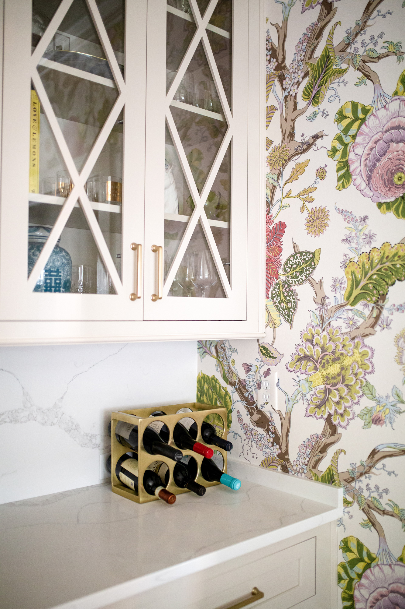
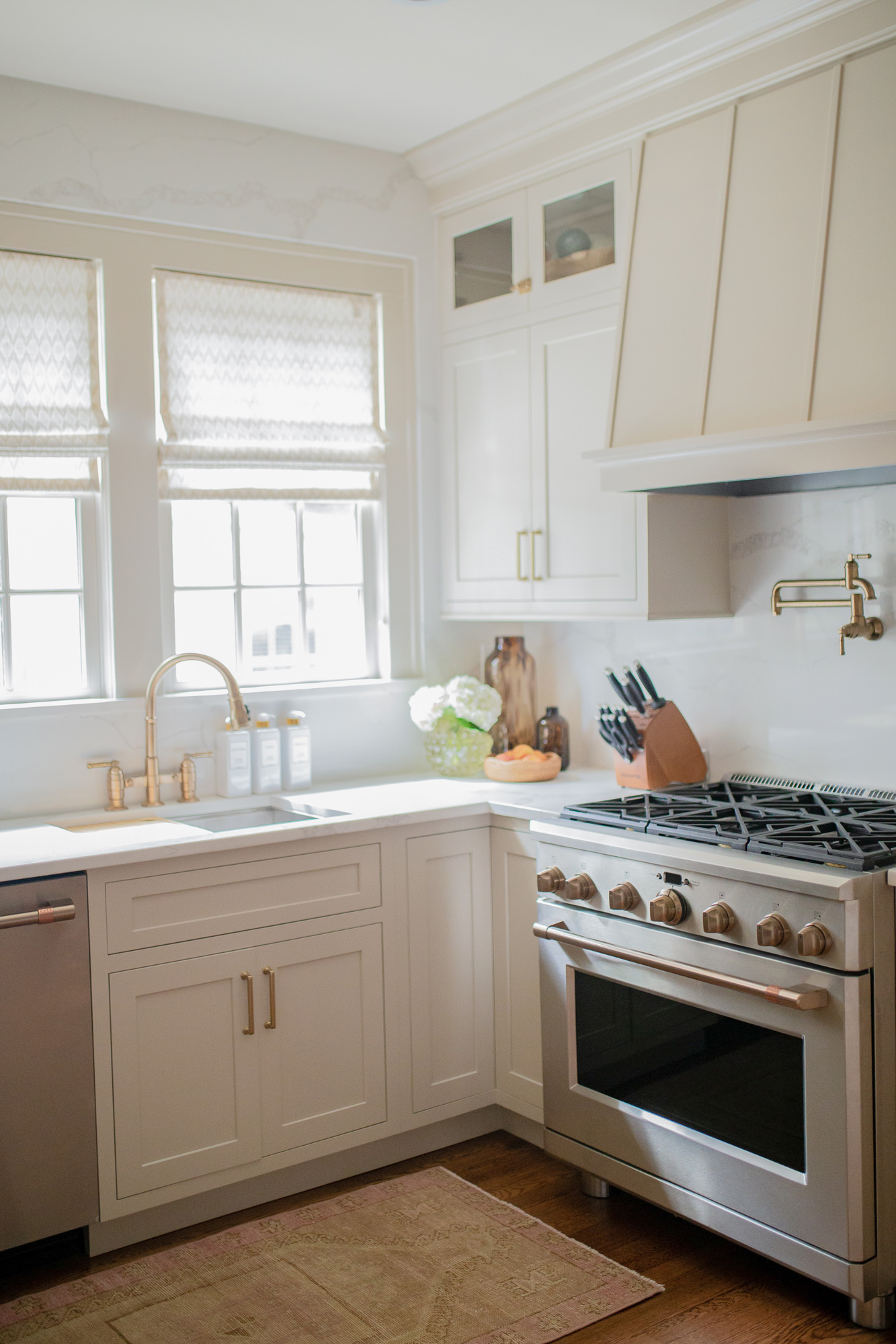
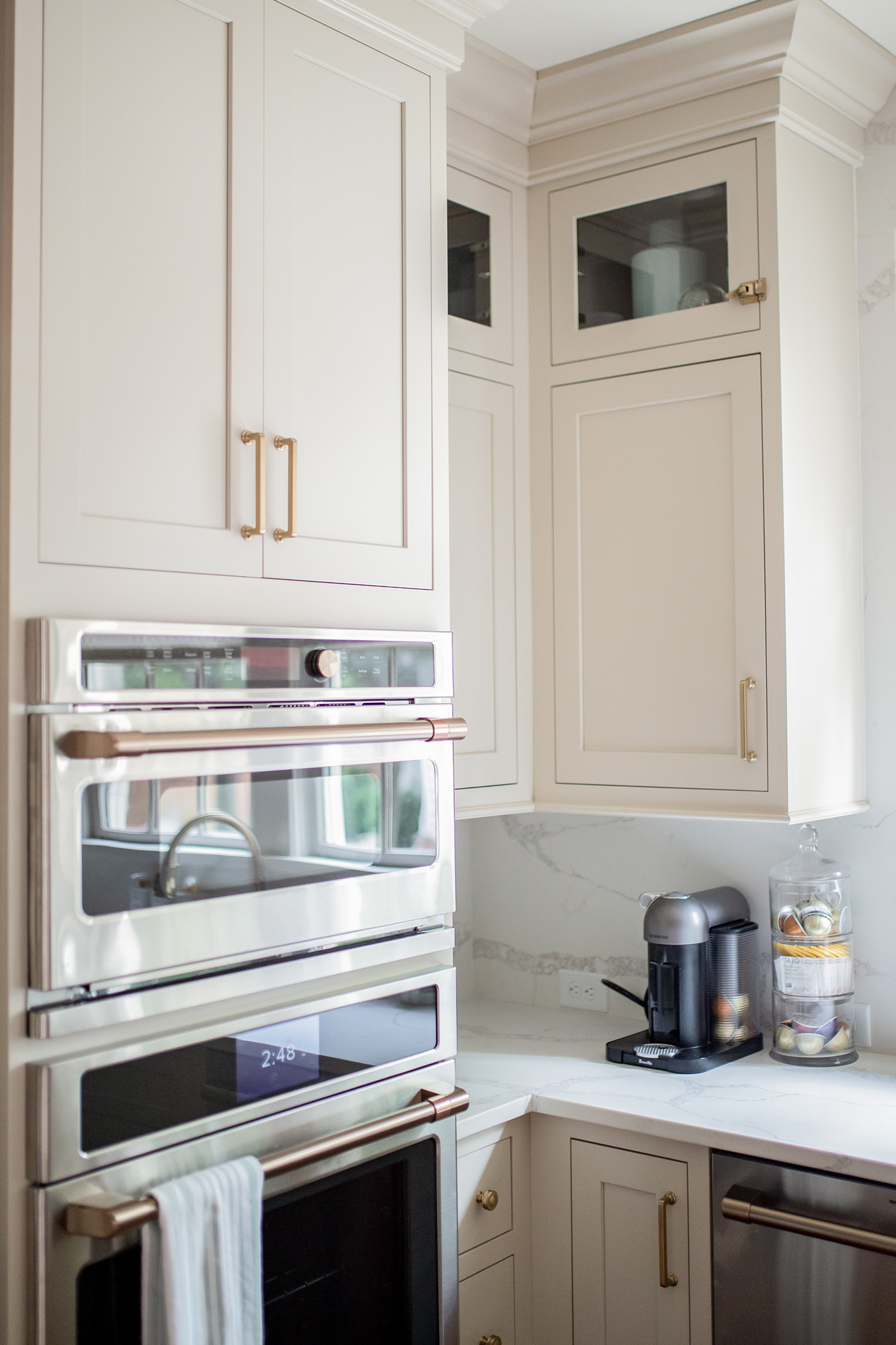
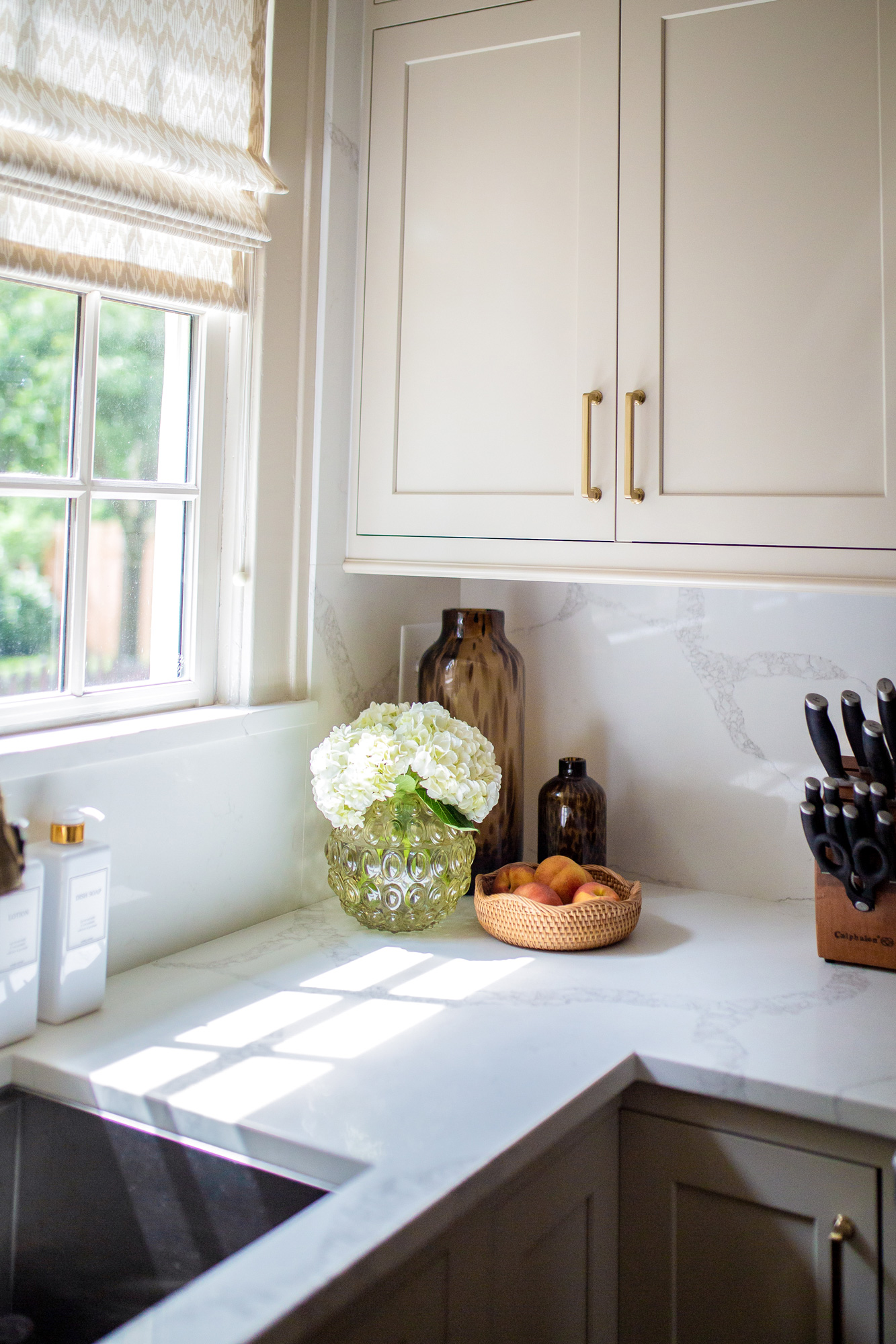
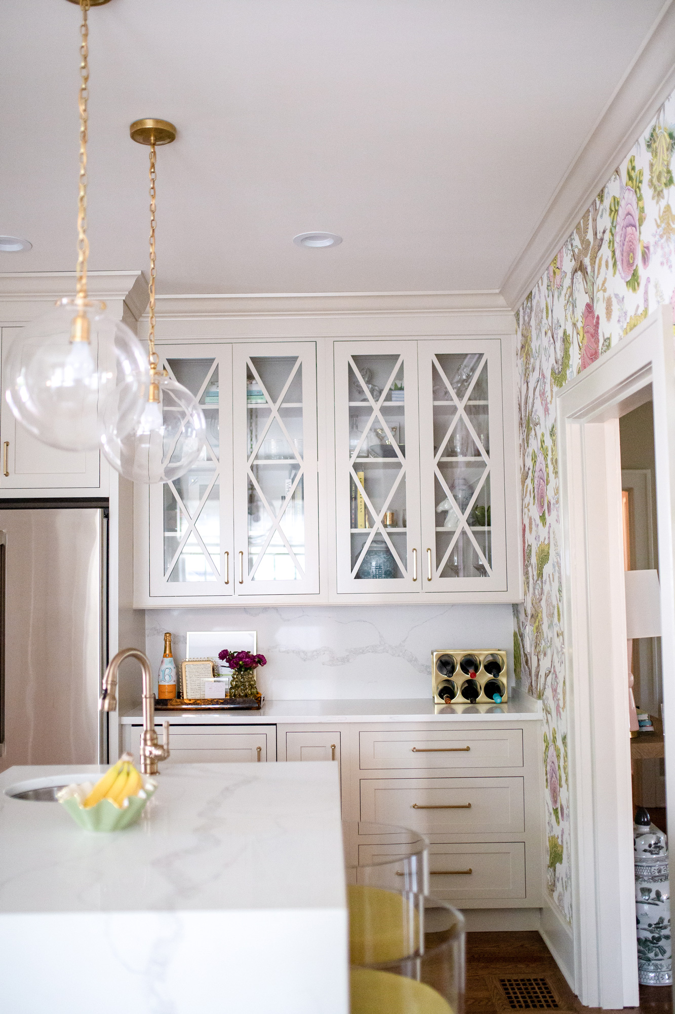
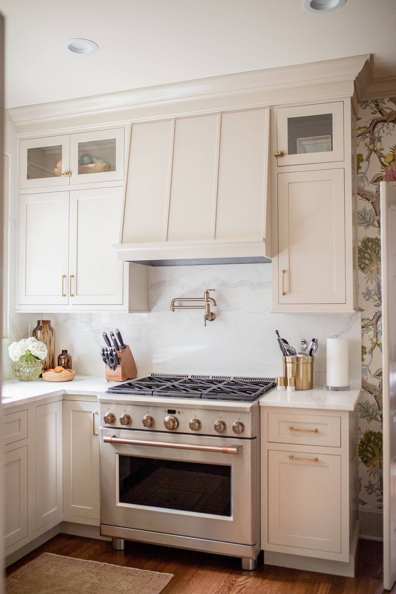
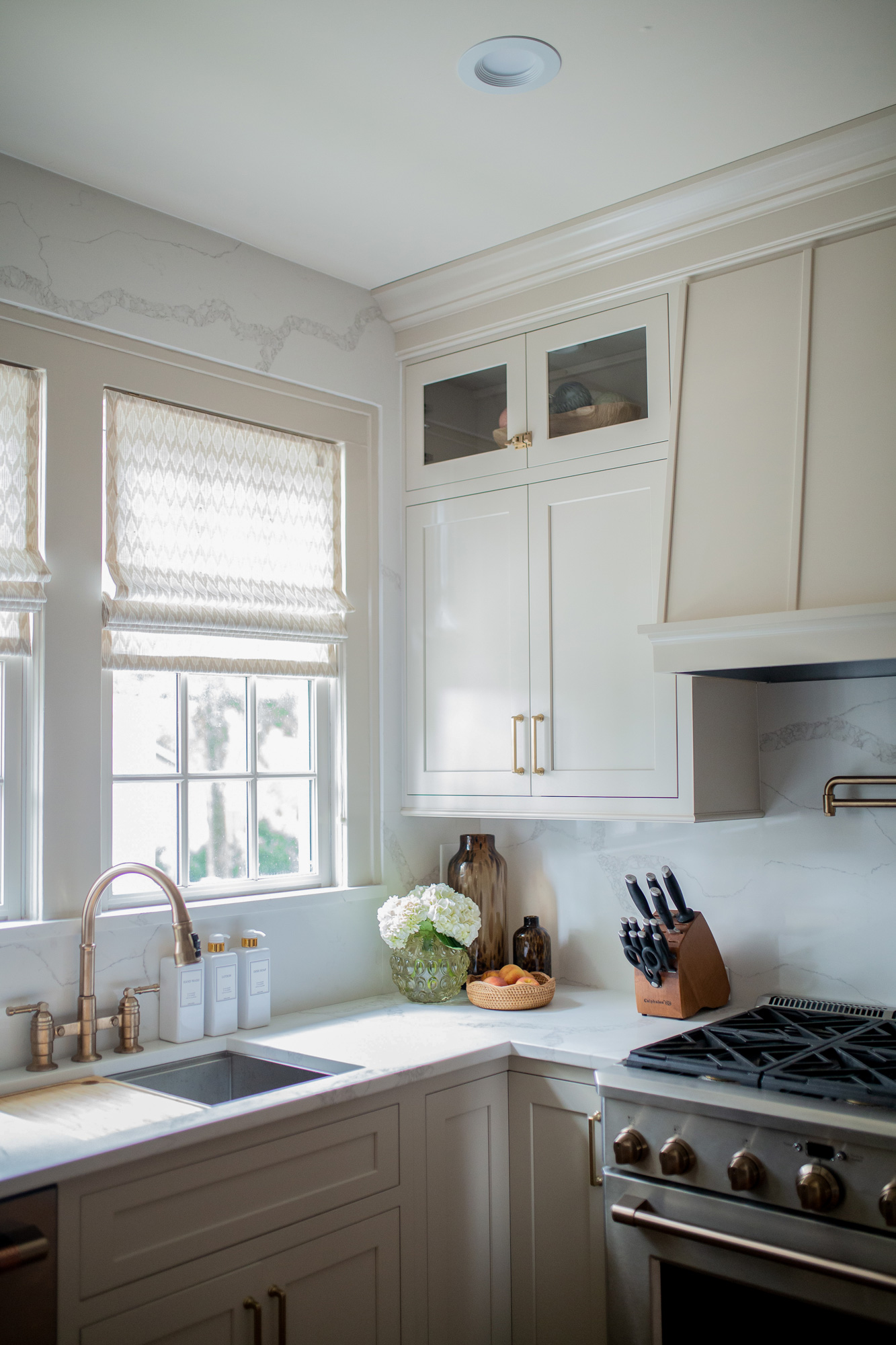
This has to be my most asked question regarding our kitchen! So let’s get right to it! Our cabinets are by Shiloh. They’re inset, with a shaker door front & are finished in Sherwin Williams Accessible Beige.
When we first began the kitchen reno process, I went in assuming we would have white cabinets. That’s what we had in our first home & what we had in this house when we moved in. A white kitchen is beautiful! The more I looked at inspiration pictures, the more I found myself drawn to an off white cabinet design. It provides warmth to the space & fit with the vibe of our 1938 home more so than a stark white kitchen.
I love how the cabinets turned out & am so so glad we went with an off white cabinet color!
The Kitchen Wallpaper:
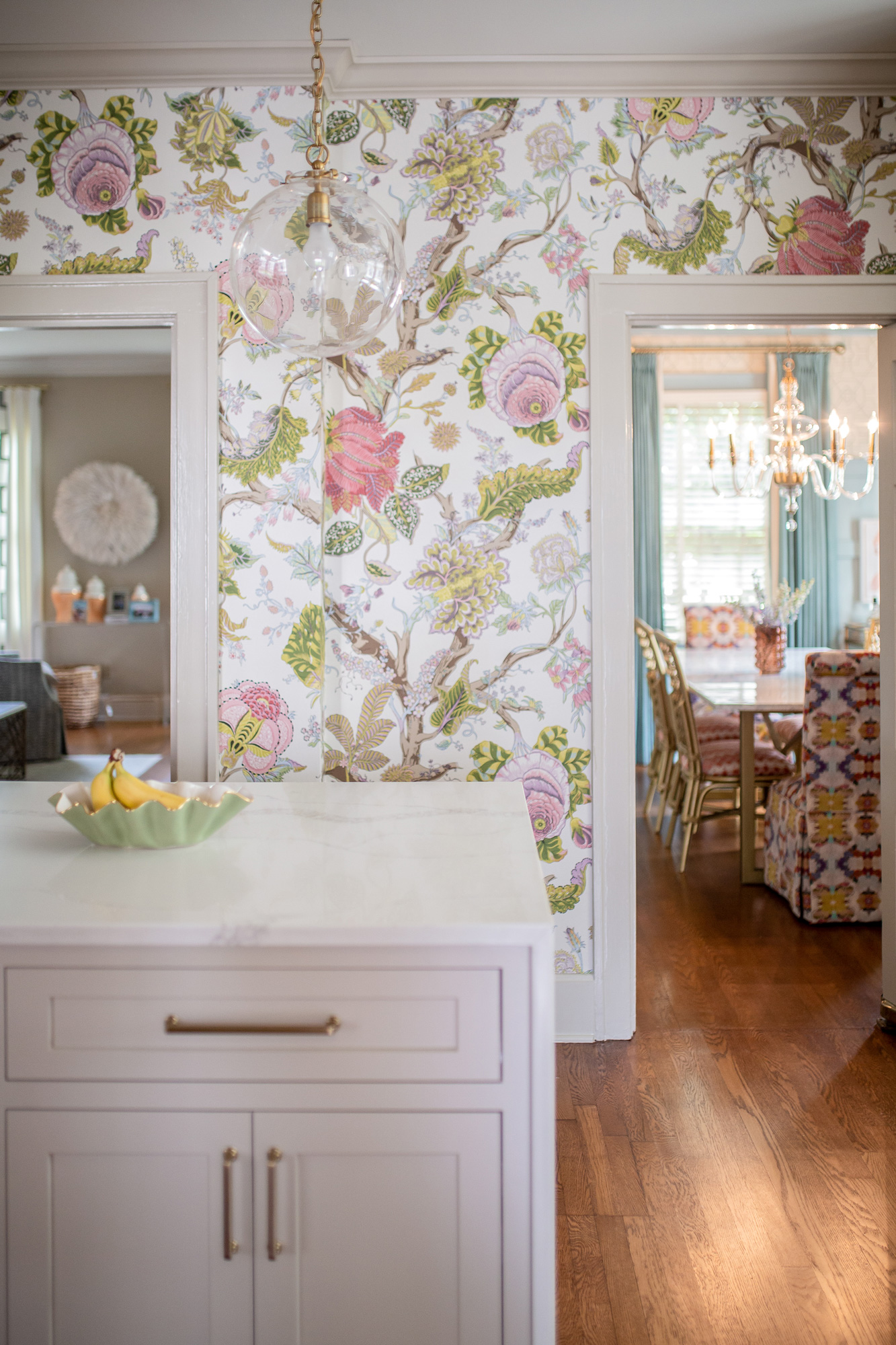
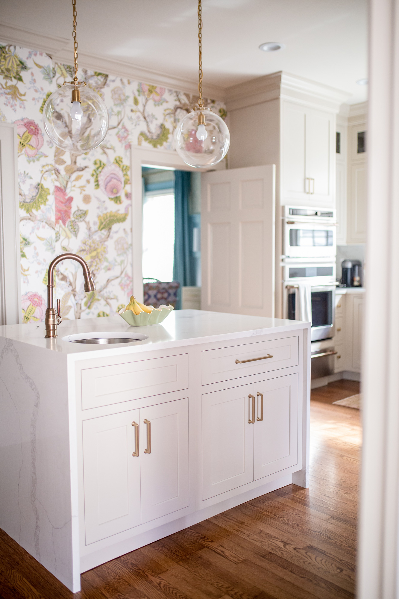
Ah. This might be my favorite thing about our kitchen. It completes the space in such a fun way, and I could not love it more. As I mentioned above, our kitchen layout was a bit tricky to deal with as far as lay out is concerned. With 4 doorways to deal with, we were left with two walls of blank space. Unable to utilize them for cabinets, I was determined to either find really cool art or go the wallpaper route.
It took me a minute to get on board with kitchen wallpaper. It felt like something that was reserved for the kitchen I grew up in in the 90s. But the more I scoured wallpaper sites, the more I realized I wanted to go for it! I had so many ideas running through my head, so that’s when I turned to Meghann at Adelé for help.
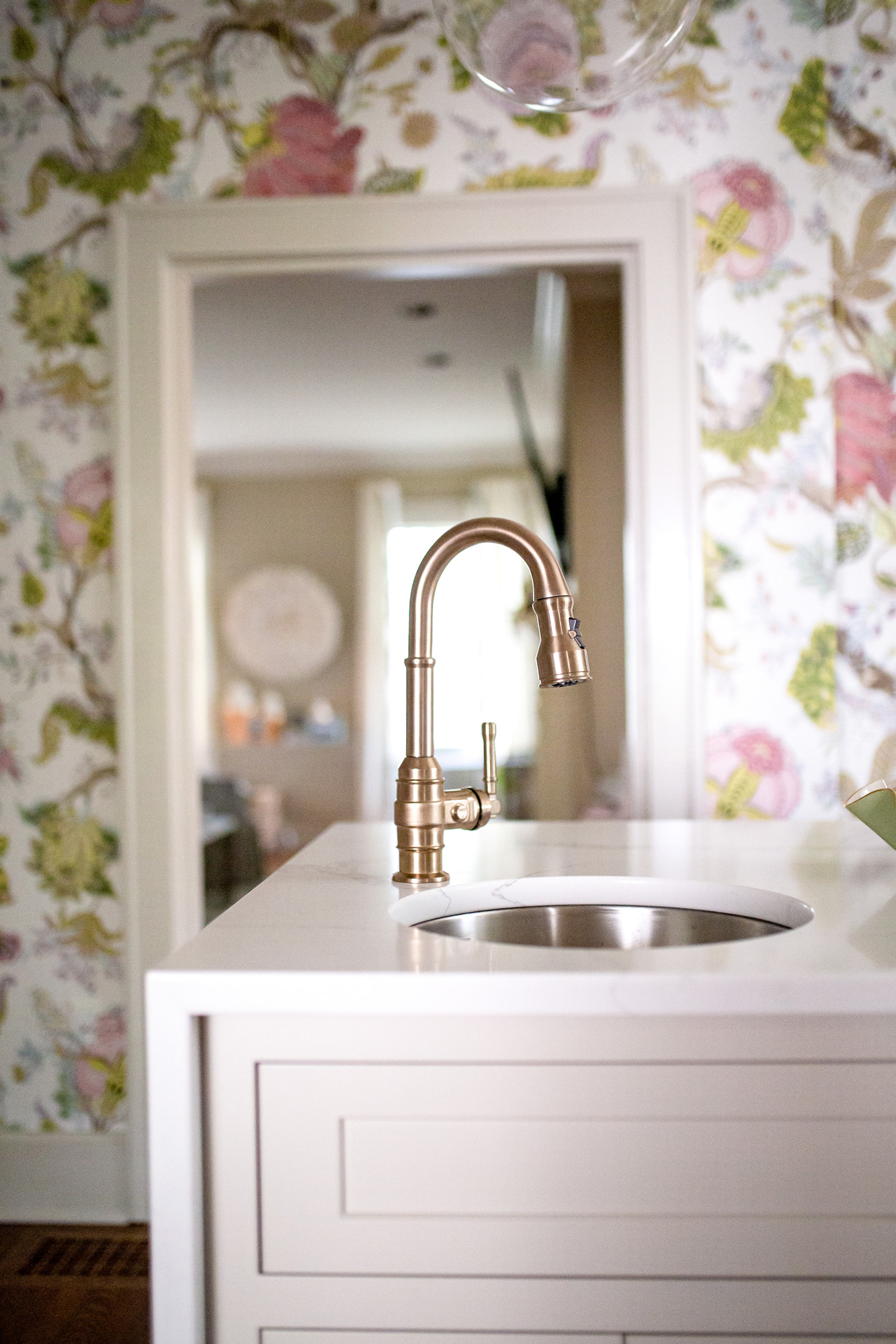
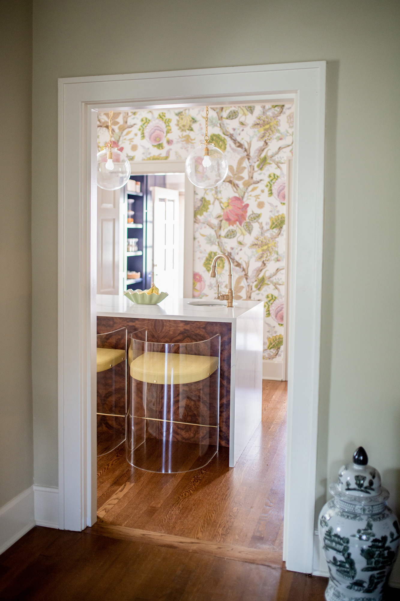
Finding the right wallpaper was a bit tricky. From one side of the kitchen you can see into our living room & dining room (like in the photo above), so we needed to be mindful of those design elements. We also needed to consider the wallpaper we already have throughout the home. In the dining room we have a grasscloth, geometric design above the wainscoting & we also have a botanical print in the entryway. After several samples & weeks of contemplating, we went with Indian Arbre in the Spring colorway. The colors are my favorite part of this wallpaper. The greens & yellows are warm & inviting, and the pops of pink & blue compliment the rest of the house. Scale was also something that ultimately made us pick this print as well. I love the larger scale of the print.
I know wallpaper isn’t for everyone, especially a large botanical/floral print, but if there is one thing I can do it’s to encourage y’all to have fun in your homes! Take risks, and make it your own. That’s exactly what the wallpaper was for us– a fun risk that paid off and totally made the space in my opinion. Otherwise it would just be another neutral kitchen 😉
Bob Banker did our wallpaper install & was amazing.
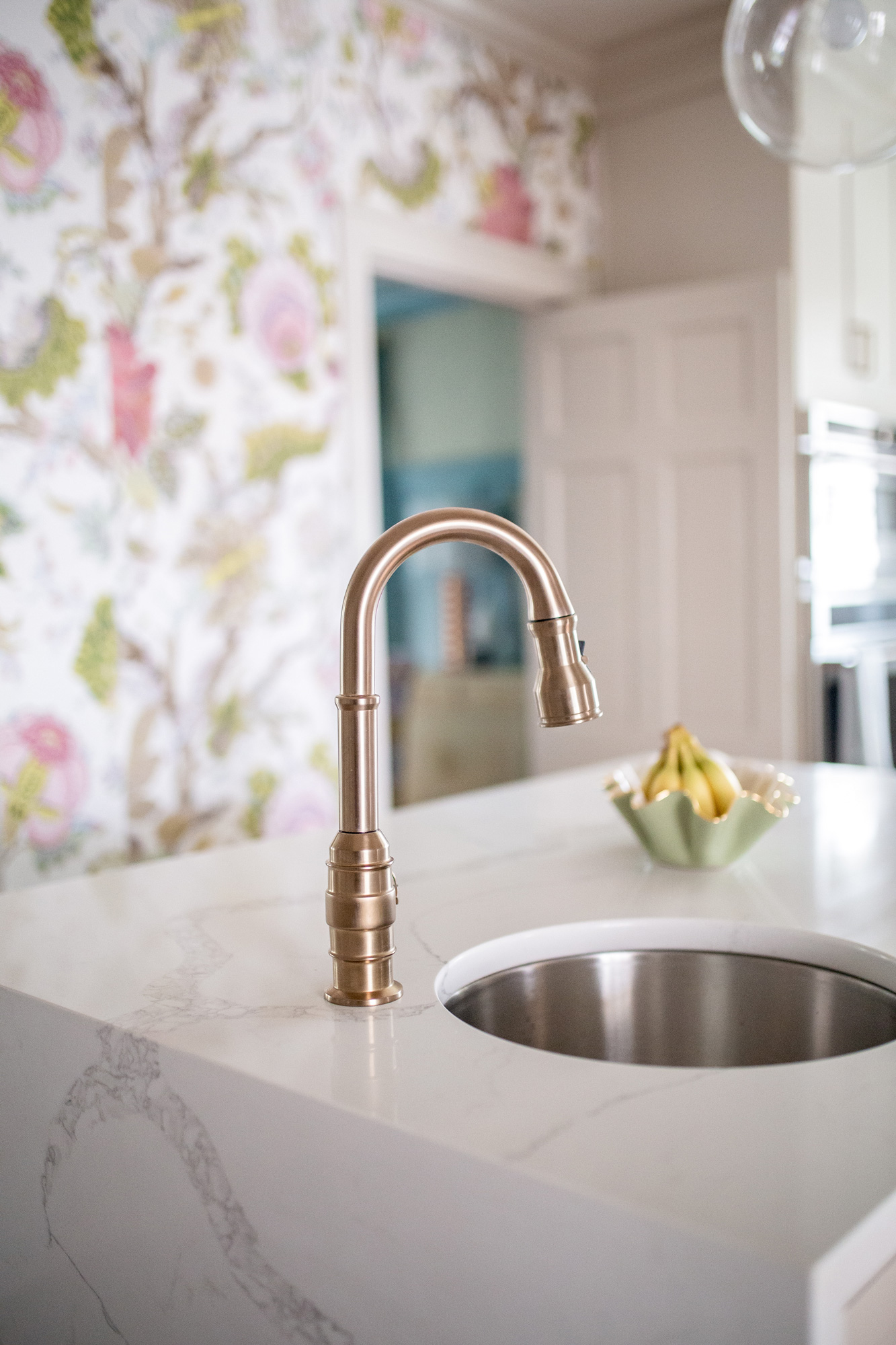
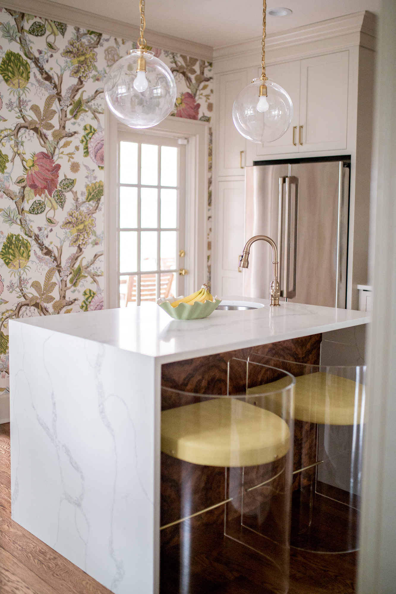
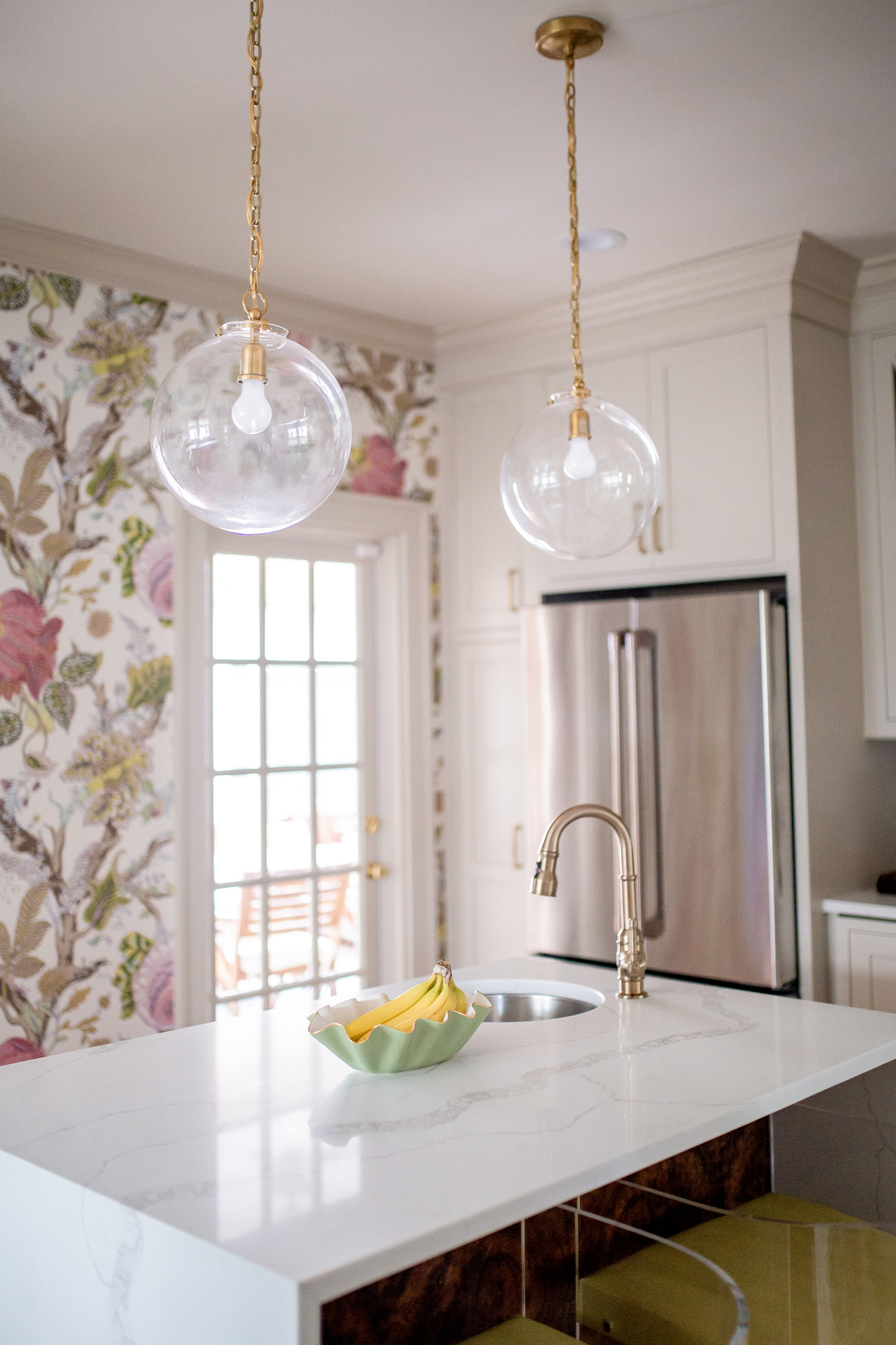
This little prep sink is one of our favorite elements in our kitchen! I was torn on the necessity of it during construction. Given the amount of space we had to utilize, our island could only be 5ft(ish) by 3ft(ish). I didn’t have my heart set on taking up a bunch of that space with a sink. We ultimately decided to go with it & are SO glad we did. We use it all the time to wash produce, thaw frozen items, as cocktail sink, etc.
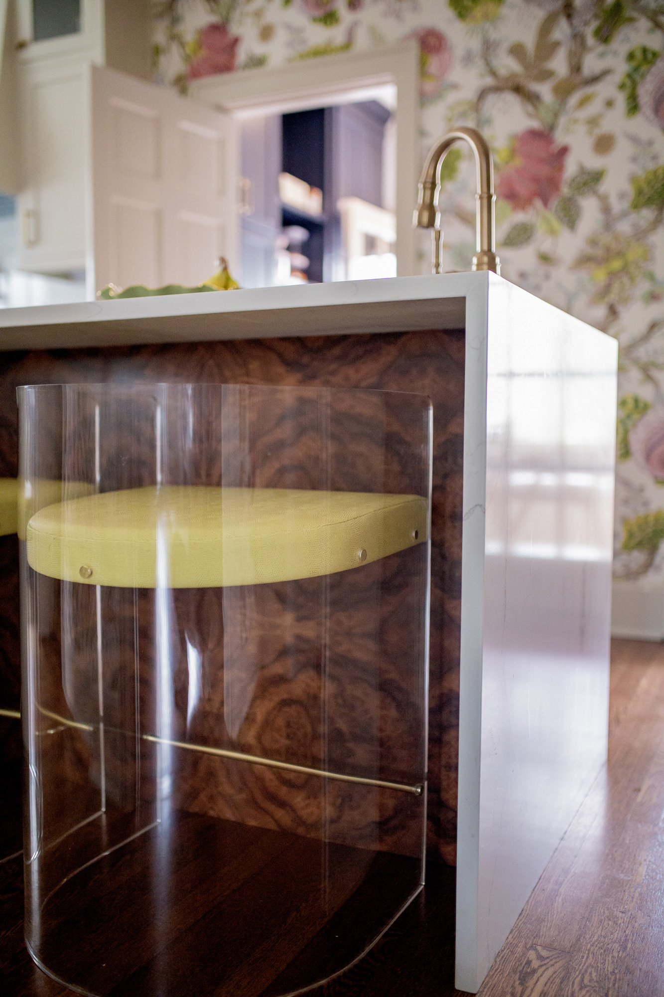
Kitchen Island Details:
This burlwood island + barstool combo was totally inspired by Jewel Marlow. Jewel has the coolest home decor style, and I have been in love with her kitchen island for months. I reallyyyyy wanted to recreate it in our kitchen design, but wasn’t sure how to go about it! Burton Made does custom woodworking in Lexington, and Doug did such an amazing job sourcing the burlwood & finishing it to perfection.
I was on the hunt for acrylic barstools that allowed you to see the beauty of the burlwood. While I loved the look of the ones in Jewel’s home, I wanted to keep my eyes open to other options. But much to my surprise, I was perusing CB2 one day & spotted a nearly identical pair (sadly they don’t seem to be online any more). Because our island is on the smaller side, we could only go with a pair of them. Upon arrival I was blown away by the quality of the barstools. The sturdiness was something I was worried about, but they are super sturdy.
Originally the barstools came with a white velvet seat. The white was a little stark & we were looking for something to compliment the wallpaper, so Meghann found a really great faux leather fabric by Robert Allen that looks so cool against the burlwood! Adelé’s upholstery contact handled the reupholstery of the cushions.
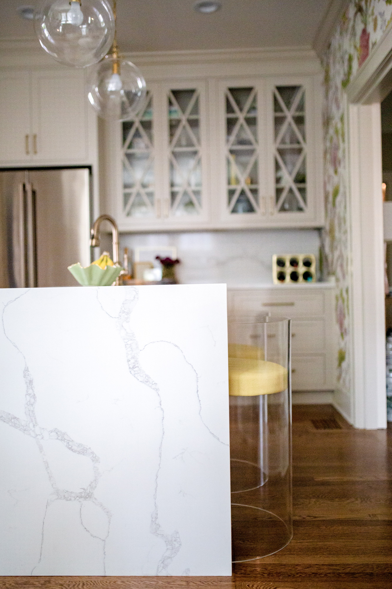
Countertops:
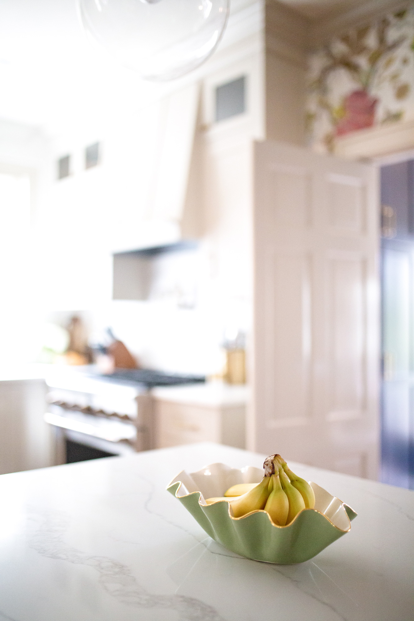
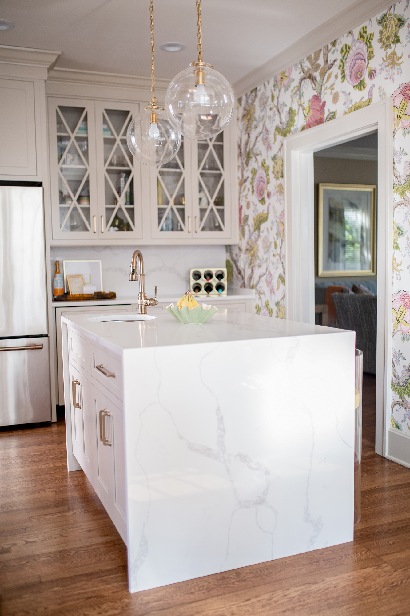
Because we went with an off white cabinet, I really wanted to find a countertop that provided a nice contrast between the two. We decided to go with quartz in Calacatta Verona. We sourced the countertops through Quality Stone, and they were incredible. They did a flawless job on the install & we are really pleased with how everything came together.
Our waterfall island is another favorite element in the space. It’s a more modern design element given the more traditional feel of the wallpaper & I love the contrast between the two! Because the island is small, we wanted to make a statement with it & the waterfall edges were just that.
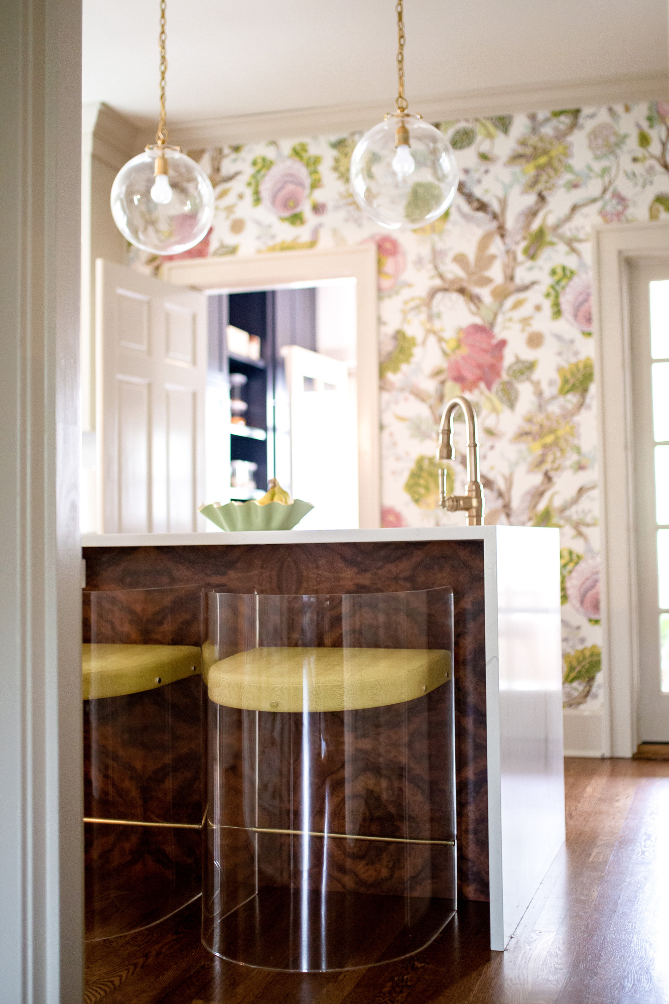
Island Pendants:
These simple, yet chic globe pendants are the perfect touch. I love the thick brass link. Simplicity is not something I do well, so thank goodness for Meghann & her suggestion to go with these pendants.
Appliances:
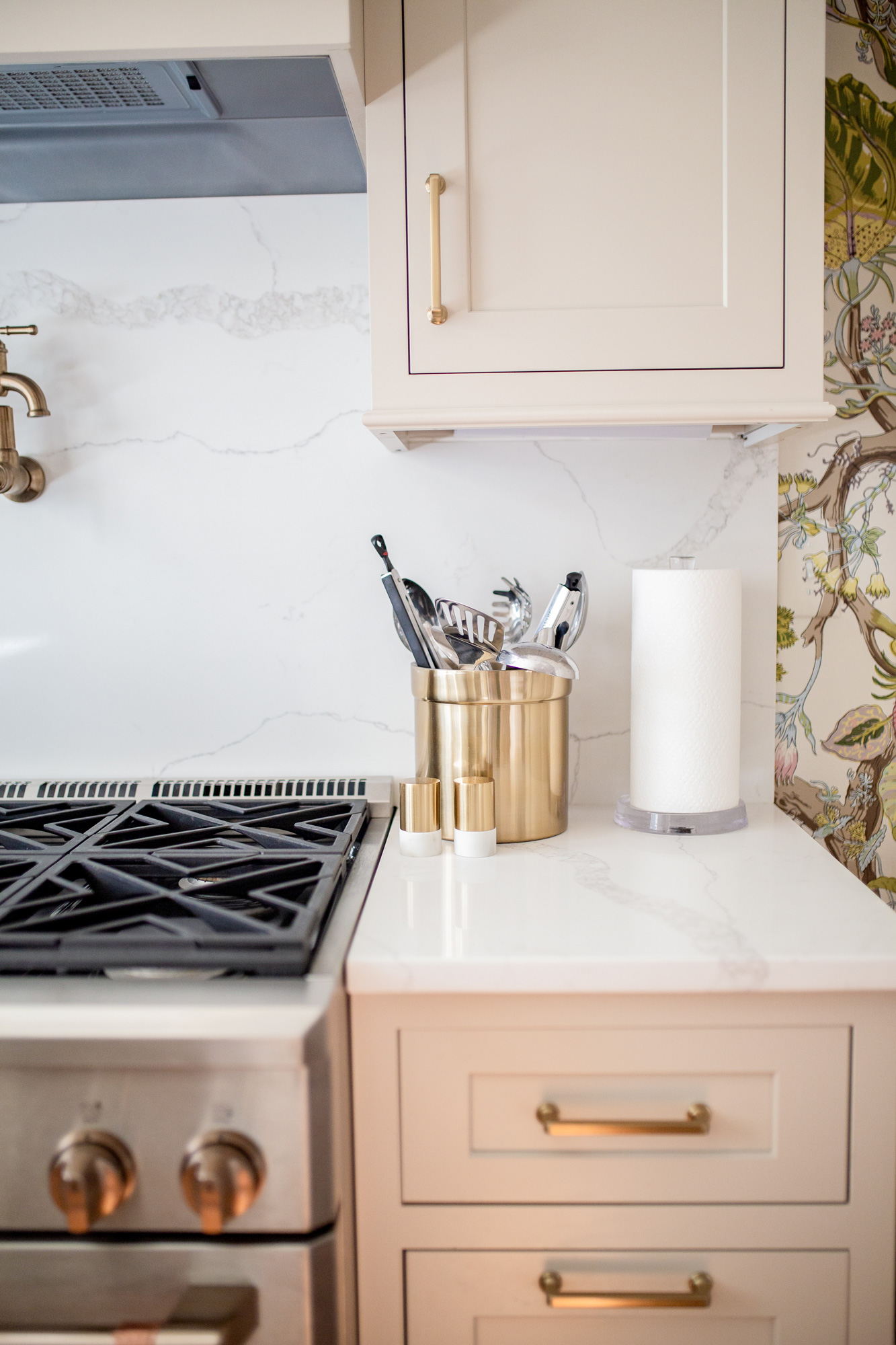
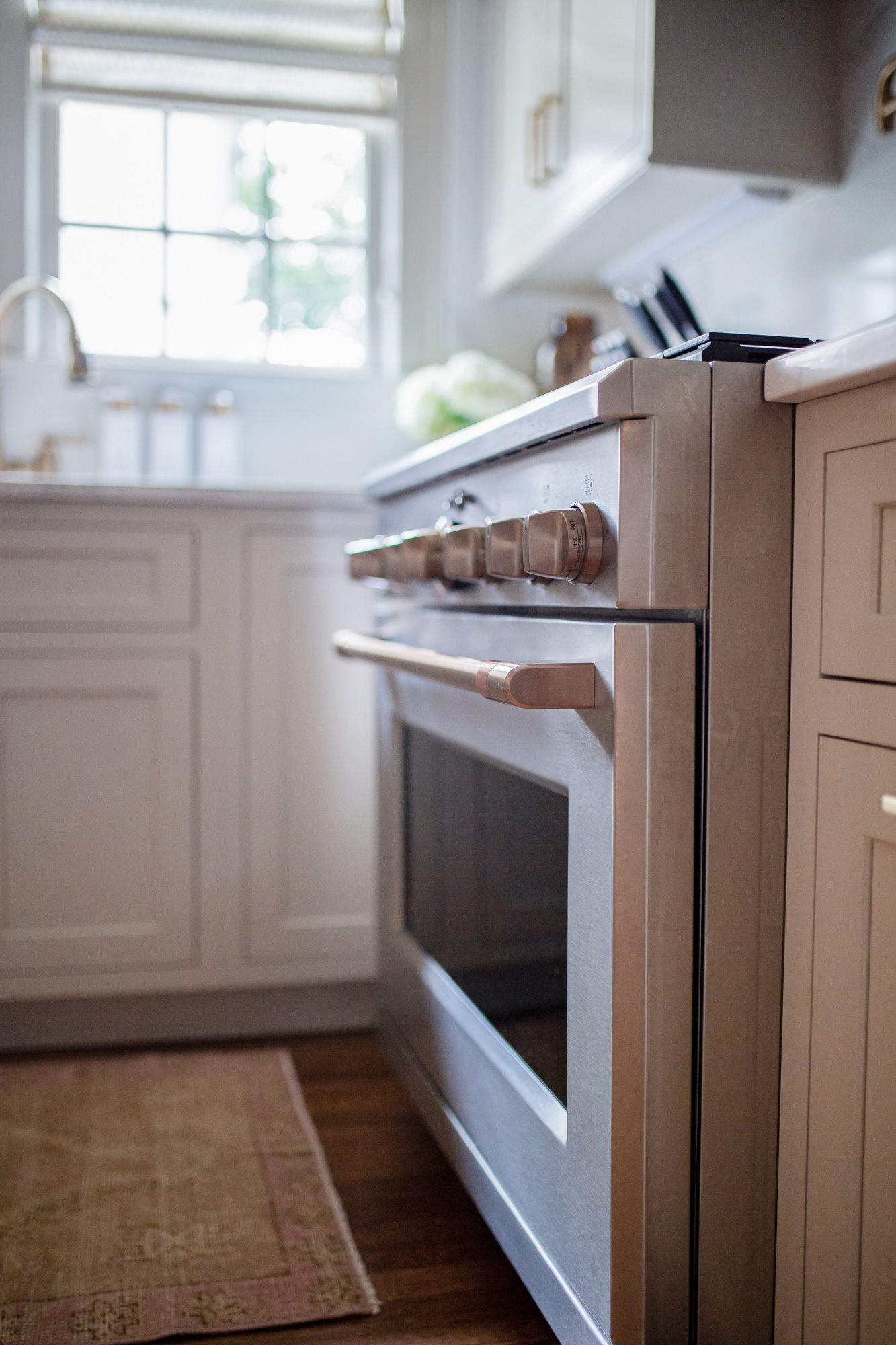
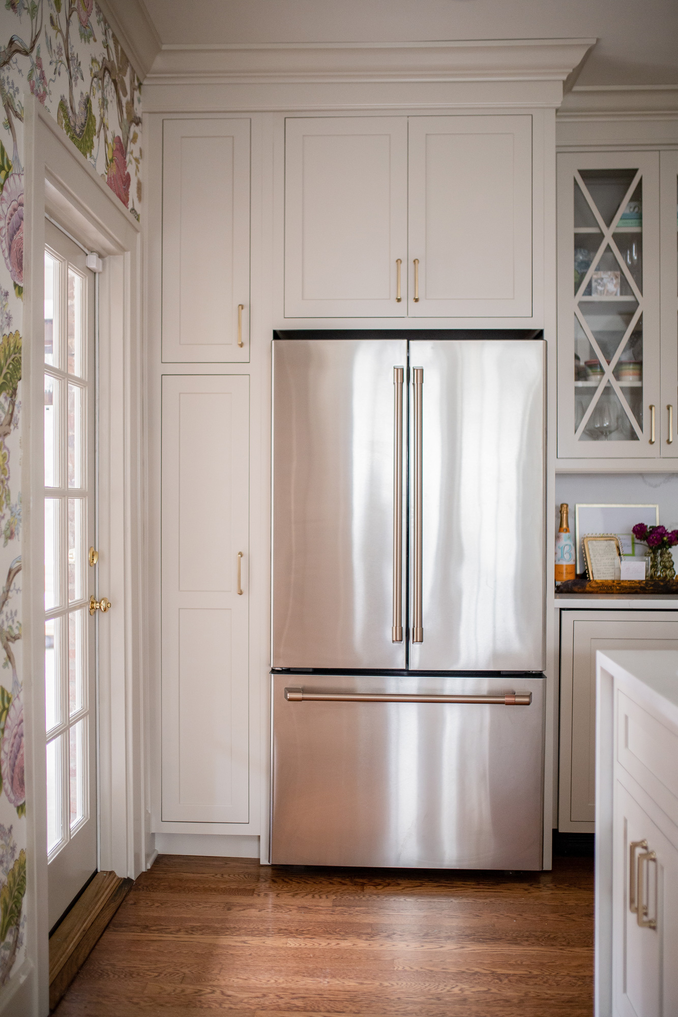
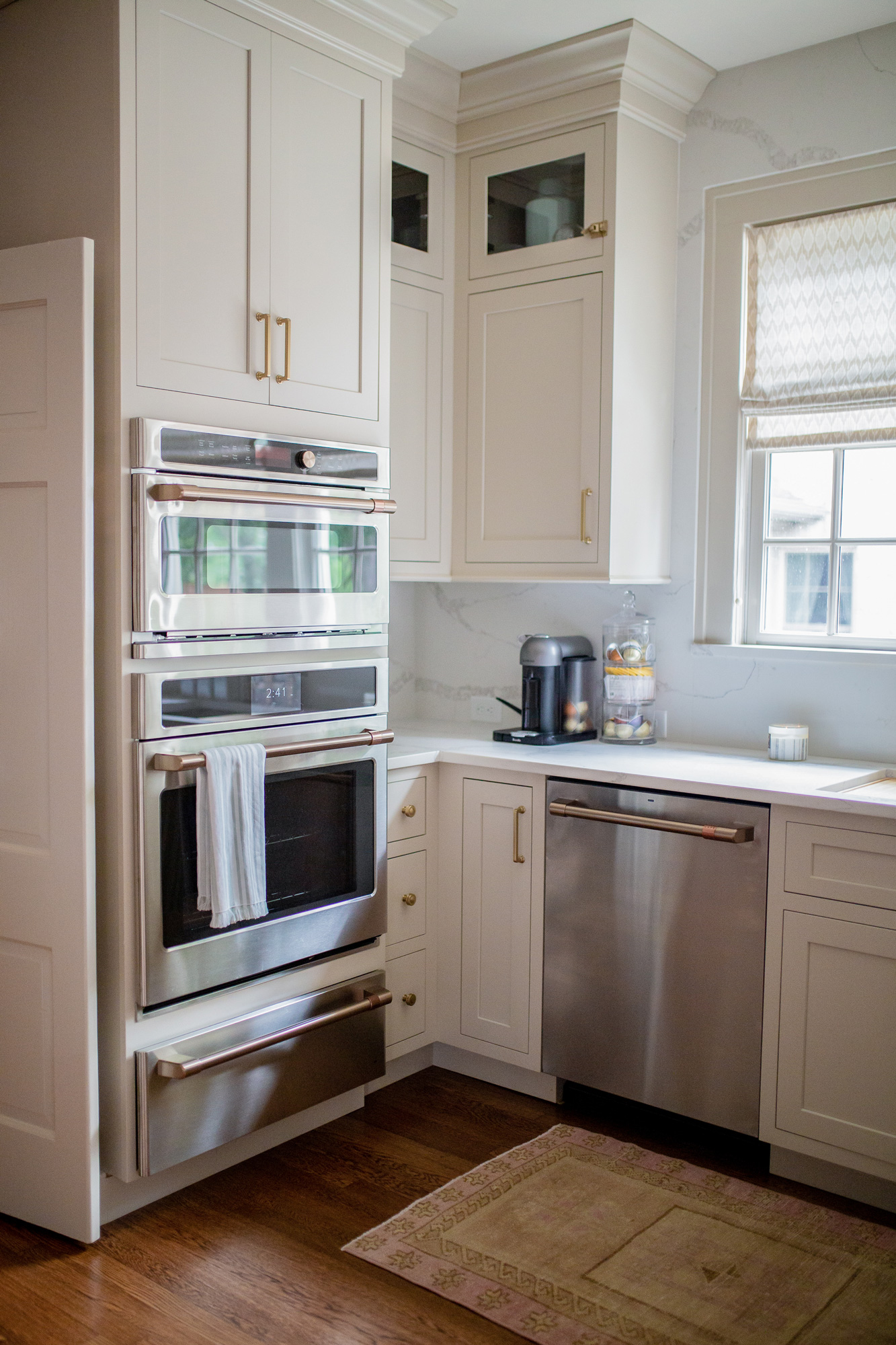
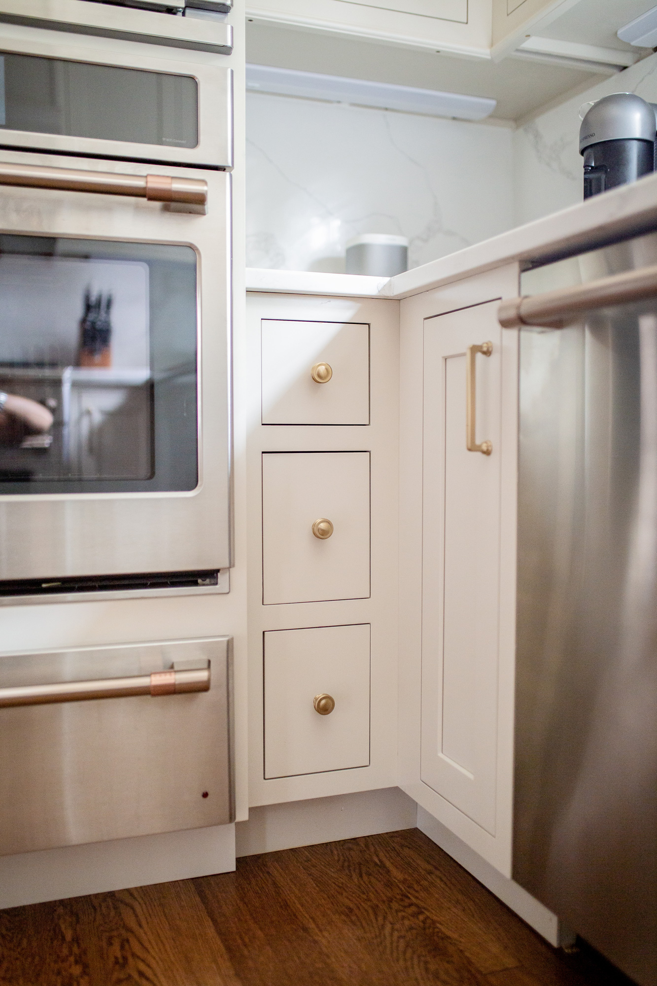
The minute we decided we were going to tackle then reno, I knew I wanted Café Appliances. The look of them was everything I wanted, and no other brand really gave me the look I was going for. It might seem silly to base your appliances on looks, but whatever! The quality is very nice, and we’ve been so pleased with them. We went with the stainless steel finish & brushed bronze handles.
Double ovens were a must have for us. We had them when we moved into this home, and once you have them it is hard to go back! I love to host & entertain, and having double ovens is a game changer. We rounded out the appliances with a warming drawer & I’ve been pleasantly surprised how much we’ve used it!
Kitchen Hardware:
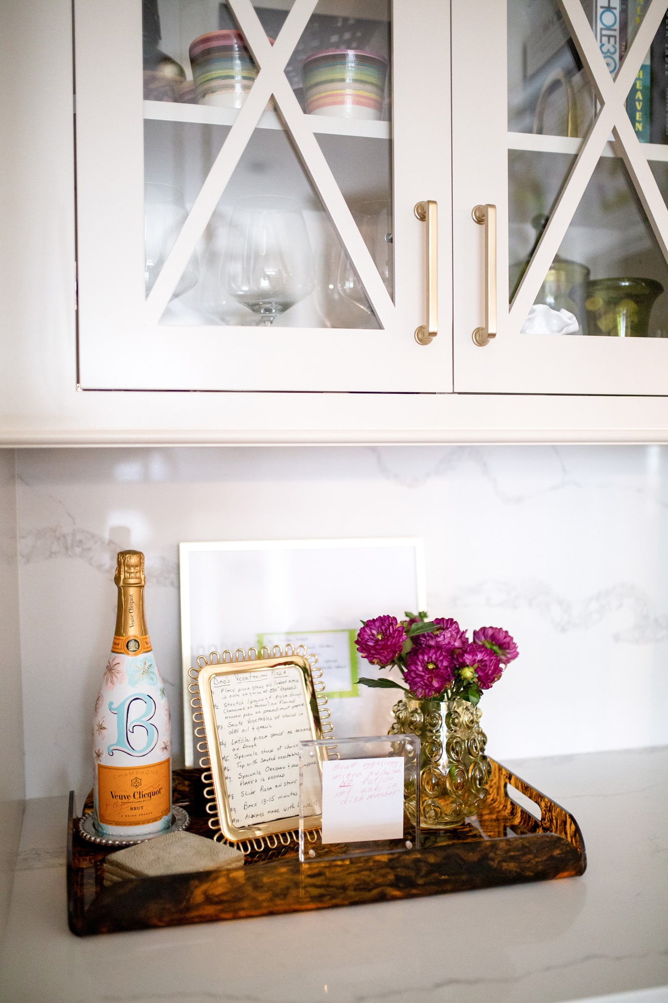
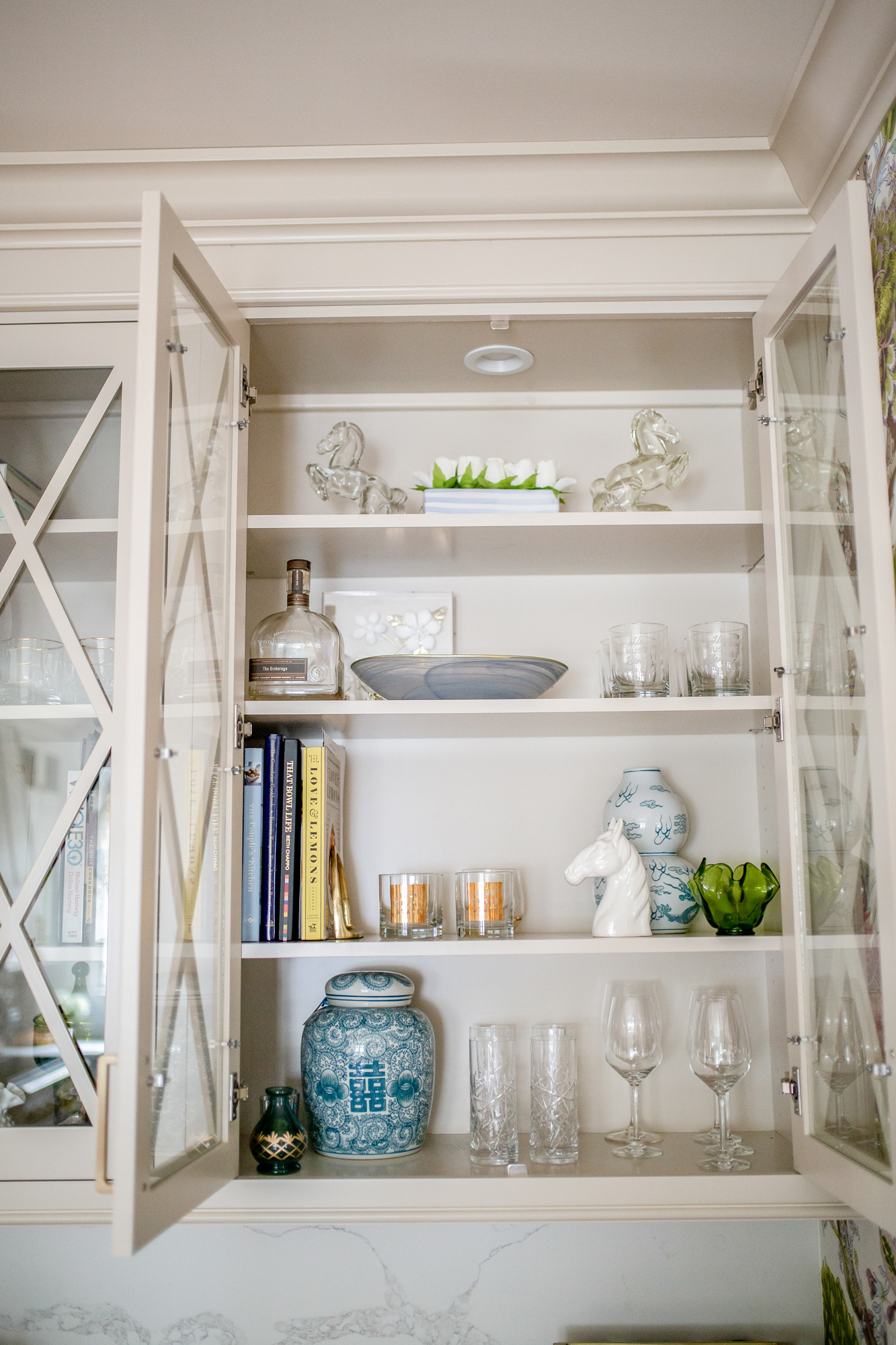
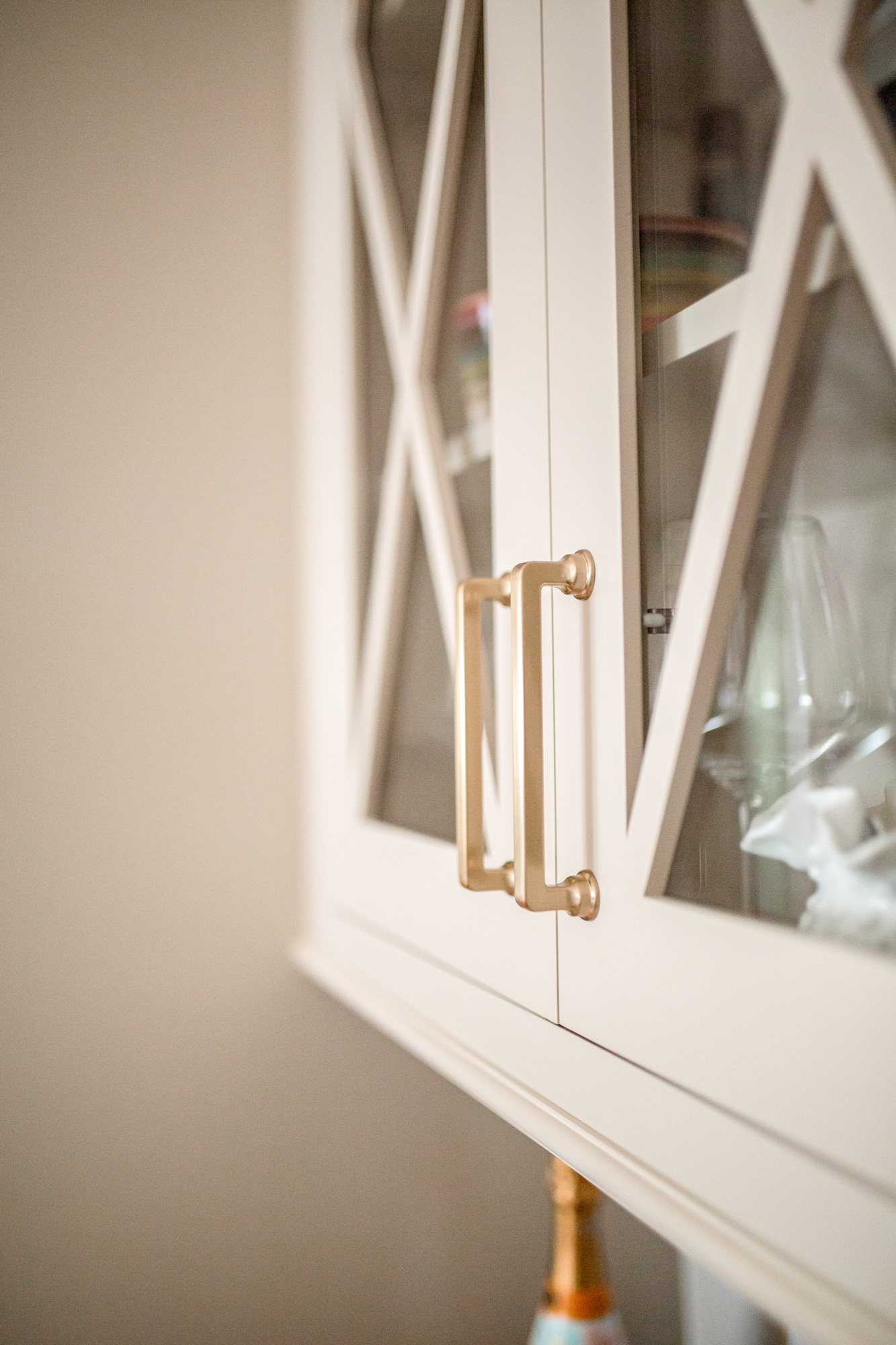
We went with the Malin collection by Atlas hardware in “warm brass”. I love the soft edges & round base of the pulls, they compliment the transitional design of the rest of the kitchen.
Kitchen Faucets:
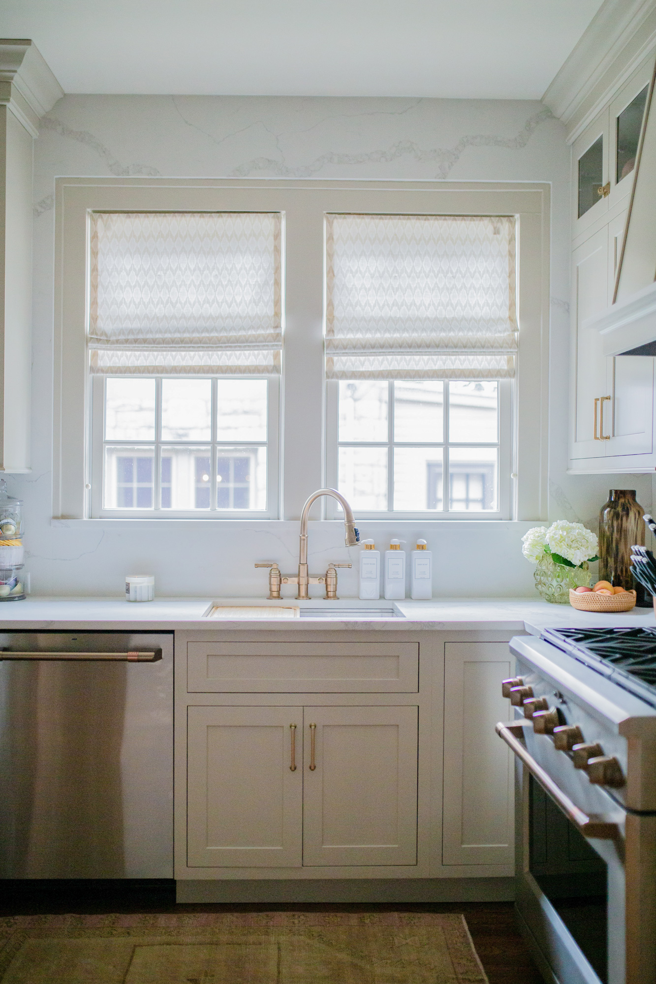
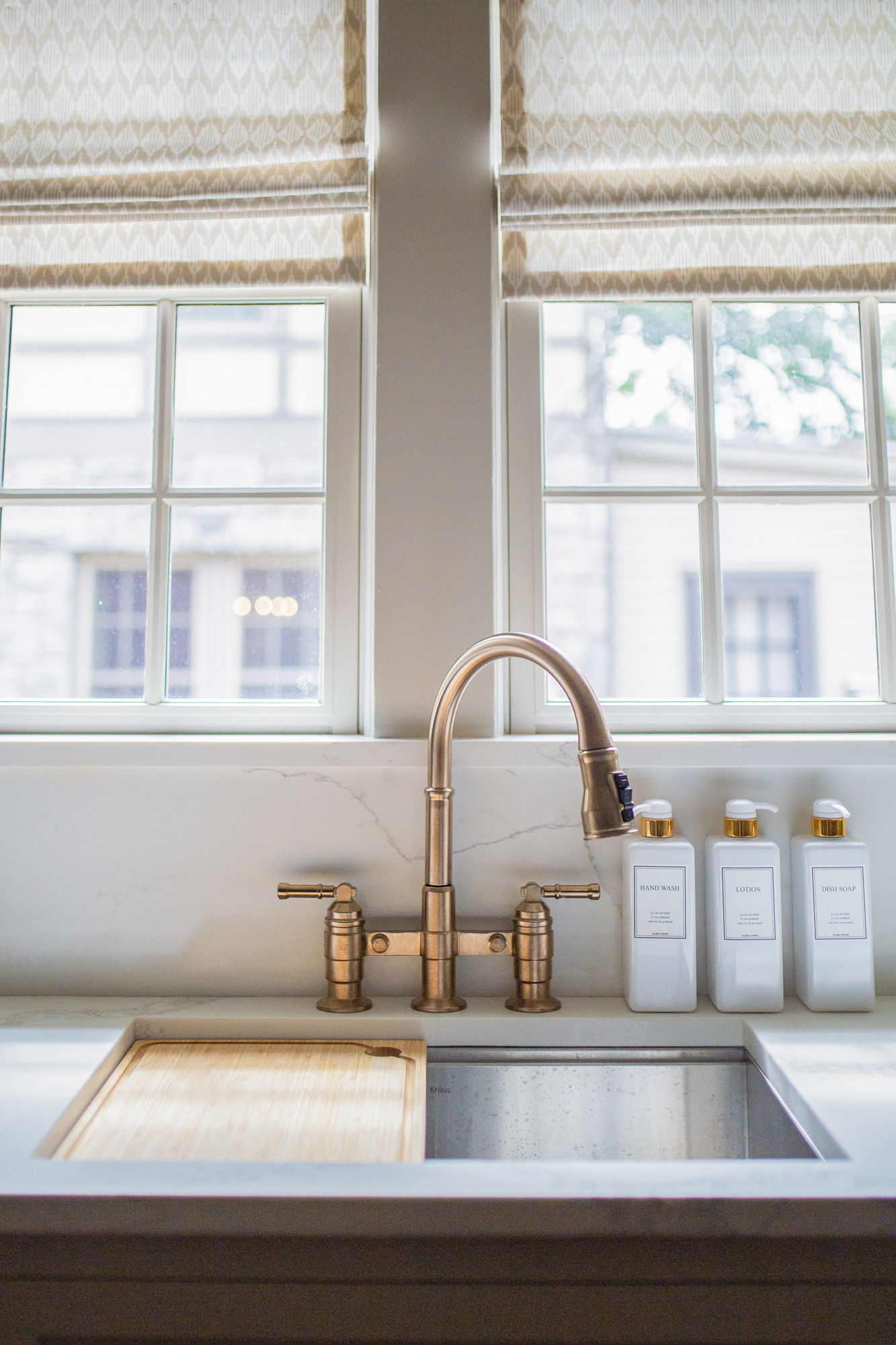
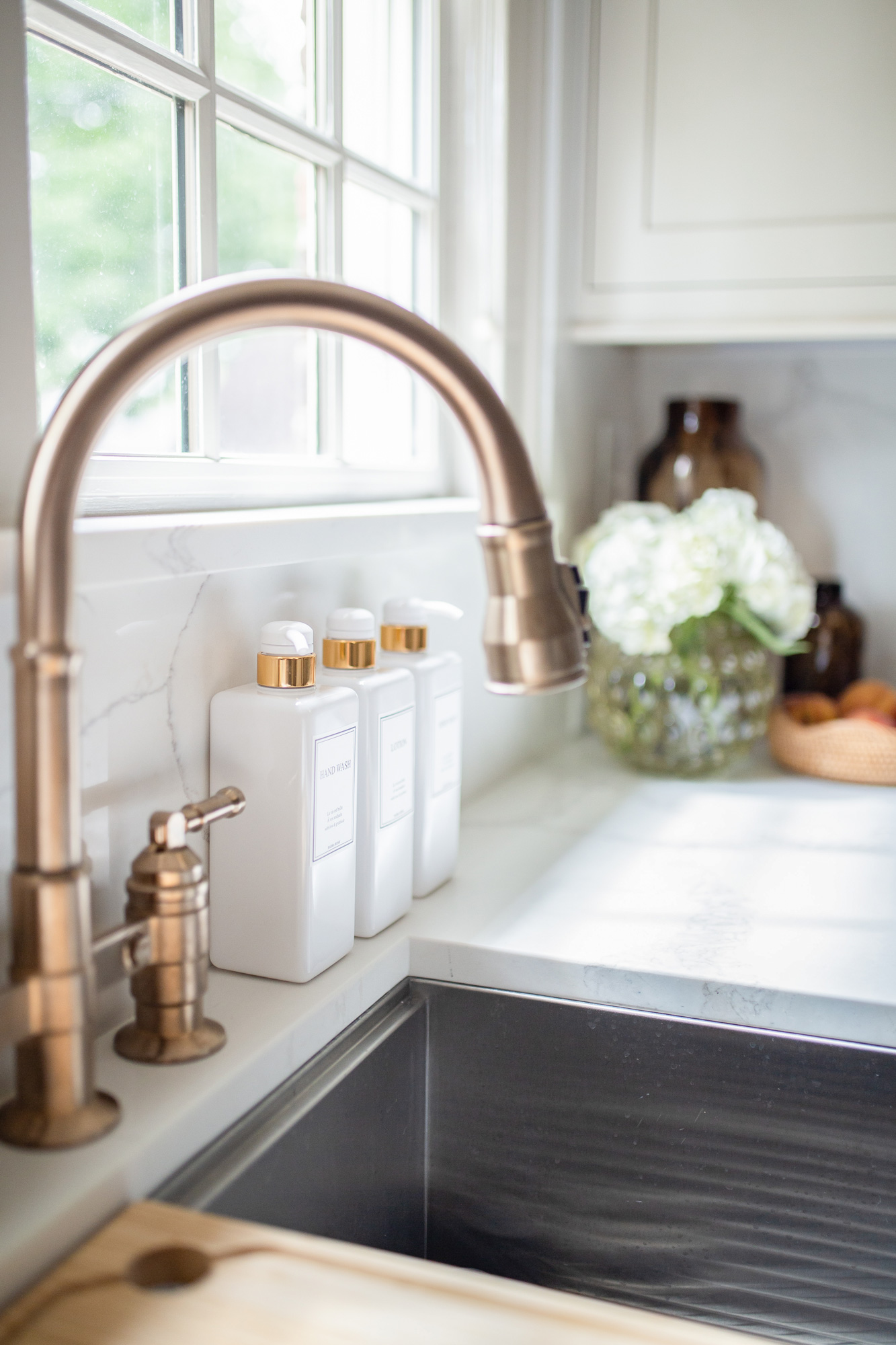
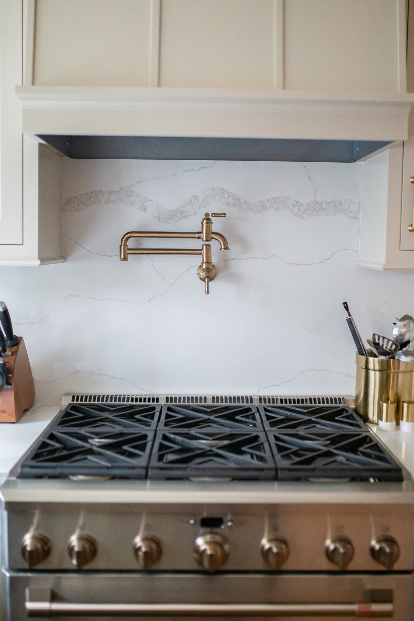
When it came to our kitchen faucets & pot filler, we went with the Broderick Collection by Delta in Champagne Bronze.
Backsplash & Window Treatments:
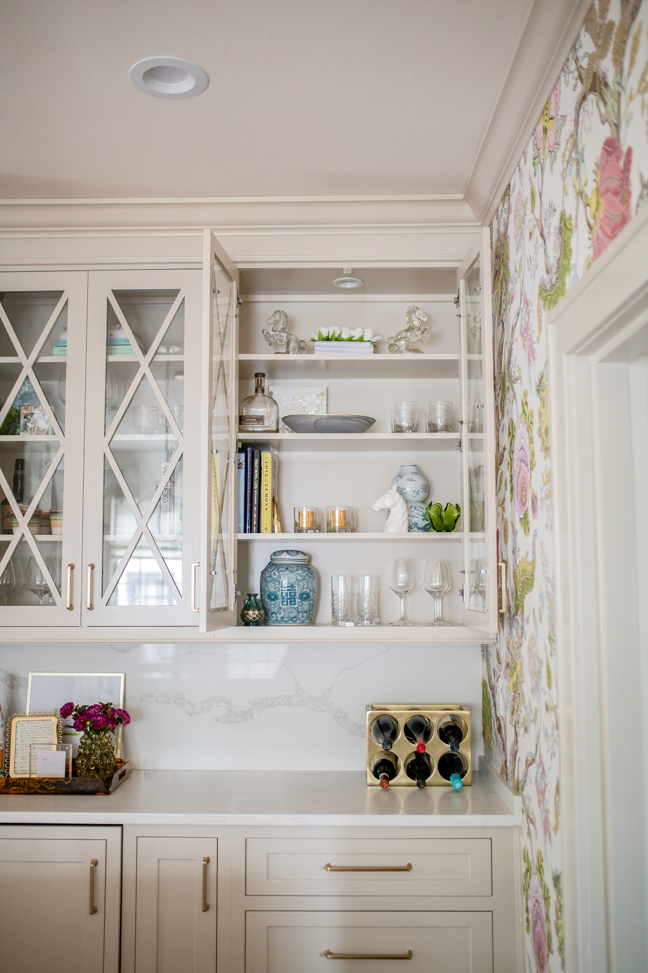
I was having a hard time deciding on backsplash. I didn’t want anything to take away from the countertops & wallpaper, and wasn’t finding anything I loved. Ultimately we decided to take the exact quartz we used for the countertops, and use it as a “backsplash” as well. I love the seamlessness it provides, and I love how it provides a more modern touch. It took some convincing, but we even decided to take it up to the ceiling over our sink. I love how it turned out!
For window treatments we went neutral, given that the wallpaper made for such a statement. Meghann found this really great neutral Ikat by Anna French, and I love the lightness of the linen blend fabric. It allows light to flow through, but provides privacy for when it gets dark outside. Adelé ordered the fabric & had the shades made to fit our windows.
And that is a wrap on our Southern Transitional Kitchen Design reveal! This has become such a special space for us, and we are so happy with how everything came together.
Shop some of our kitchen details here:



I am SO glad you went with this wallpaper it is stunning. And the hardware is so beautiful. Such a gorgeous space. Nailed it!
xo Jessica
My Style Vita
Ah I’m in love!! The details are just perfect.
Absolutely beautiful! Who wouldn’t want to sit at that island and enjoy a glass of wine while taking in the beauty of that space.
the wallpaper is everything and soooo very you! so glad you ended up going with it!!! honestly love every detail and feel the space so perfectly reflects your personality/style. just LOVE IT!
xo Laura Leigh
https://louellareese.com